New Name. Same Mission.
For five decades, CAPA has walked alongside children and families facing abuse, trauma, and overwhelming life challenges. We’ve offered a place of hope, healing, and resilience. Now, as we look ahead to our next chapter, we’re proud to introduce a name that fully reflects who we are and what we stand for: CAPACares.
Why a new name? Why “cares?”
This transformation is about alignment. We wanted our outward identity to reflect the heart of our mission and the warmth of our community.
While our work is rooted in the prevention and treatment of child abuse, our services have grown to support a much broader range of needs. Today, we serve children, adults, and whole families as they navigate complex life experiences. Our programs promote safety, connection, and healing at every stage of life.
For years, “CAPACares” has appeared in our web address, hashtags, and our Instagram handle. It’s how many people have found us, talked about us, and described us.
As we approached our 50th anniversary, we knew it was time to fully embrace that identity—to lead with care in both name and practice.
More welcoming, more us
One of the main goals of this rebrand was to eliminate barriers, both real and perceived. We wanted a brand that feels as warm and approachable as the services we offer.
We know it takes courage to walk through our doors, make that first phone call, or even explore our website. That’s why every part of our new identity—the name, color palette, photography, and tone—was chosen with intention. We want people to feel seen, safe and welcome from the very beginning.
How it happened
We partnered with Crux KC through their Crux for a Cause program to guide this journey. Over the course of six months, we engaged in thoughtful reflection. Crux led exercises with our staff, board, and leadership, asking meaningful questions:
- What makes CAPA unique?
- What does our mission mean to those closest to it?
- What words or images come to mind when you think of CAPA?
Their team took what they heard—stories, insights, emotions, and lived experience—and brought it to life in a new visual identity that feels bold, authentic, and full of heart. The result is a brand that doesn’t change who we are, it simply brings that identity into sharper focus.
Sharing it with our team
Before we made the brand public, our leadership team shared it with our entire staff and board. It was important to us that those closest to the mission saw the result of their input and understood that their everyday work, care, and commitment were the true inspiration behind the new name and look.
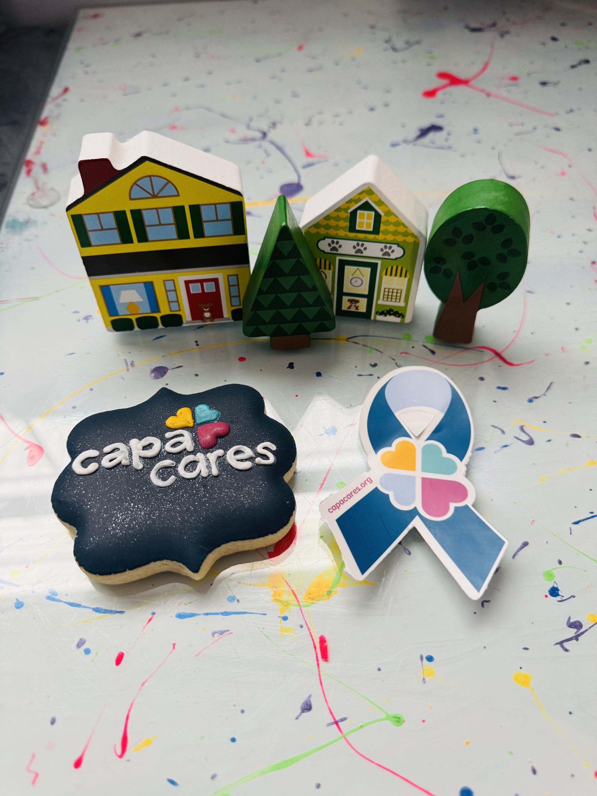
We unveiled the name, logo, and color palette during our April all-staff meeting, complete with stickers and themed cookies featuring the new mark (courtesy of Erin with Eclairs De La Lune). It was a joyful and meaningful moment.
What’s next
In the weeks and months ahead, you’ll begin to see our new identity on our website, printed materials, signage, and more. Our social media channels and website will officially transition to CAPACares in late June 2025.
This new brand honors our past while embracing the future. It reflects the healing work we do every day, the people we serve, and the community that makes it all possible—including you.
Thank you for being part of our story. We’re excited about what comes next and grateful to have you with us.
Posted in General